Creating Infographic Designs for Blog Posts: A Step-by-Step Guide
To create effective infographic designs for blog posts, you need to understand your target audience and set clear goals. This side hustle involves crafting visual content that resonates with viewers and fosters engagement.
First, identify your target audience and their preferences. Determine the type of content they engage with and the visual elements that appeal to them. Next, set clear goals for your infographic, such as increasing engagement, driving traffic, or boosting conversions.
To achieve these goals, prioritize the following elements:
- Typography: Choose fonts that are readable, consistent, and align with your brand's visual identity. Ensure headings, subheadings, and body text are clearly distinguishable.
- Color schemes: Select colors that are visually appealing, consistent with your brand, and evoke the desired emotions. Limit your color palette to 2-3 main colors to maintain a cohesive look.
- Data visualization: Use charts, graphs, and other visualizations to present data in a clear and concise manner. Avoid 3D charts and overly complex graphics that can confuse viewers.
- Mobile optimization: Ensure your infographic is optimized for mobile devices. Use a vertical layout, keep text concise, and avoid clutter to ensure a smooth user experience.
- Visual hierarchy: Organize your content using a clear visual hierarchy. Use size, color, and position to draw attention to key elements and guide the viewer's eye through the infographic.
By prioritizing these elements and taking a thoughtful and informed approach, you can create impactful infographic designs for blog posts that resonate with your target audience and drive engagement.
Define Your Target Audience
Defining your target audience is crucial when creating an effective infographic design for your side hustle. Without understanding the demographics, interests, and preferences of your potential customers, you risk creating an infographic that falls flat.
To create an infographic that resonates with your target audience, gather data on demographics such as age, location, and occupation. Research their interests, behaviors, and pain points to create user personas that will serve as a guide in crafting an infographic that addresses their specific needs and concerns.
User personas are detailed profiles that outline the characteristics, goals, and motivations of your ideal customer. By creating user personas, you can ensure that your infographic is tailored to their preferences, increasing the likelihood of engagement and sharing.
With a deep understanding of your target audience, you can create an infographic that speaks directly to them, using language, imagery, and design elements that resonate with their values and interests. This targeted approach will ultimately lead to a more effective and successful infographic design that helps promote your side hustle.
Set Clear Infographic Goals
Establishing clear goals for your infographic is vital to its success, as it enables you to effectively communicate your message and resonate with your target audience.
To achieve this, it is important to identify your target audience and their needs, as well as define the visual objectives that will guide the design and content of your infographic.
Identify Target Audience
When creating an infographic design to promote a side hustle, identifying the target audience is a crucial step. This involves analyzing demographics to determine the age, sex, location, and socioeconomic status of potential customers. Conducting this analysis helps create buyer personas, which are fictional representations of ideal clients.
Further, segmenting the target audience can reveal distinct subgroups, such as entrepreneurs, freelancers, or part-time business owners. Understanding the unique needs and interests of each subgroup allows for the creation of targeted infographic content that resonates with each segment.
Define Visual Objectives
Defining Visual Objectives for a Side Hustle Infographic
With a well-defined target audience in place, the next step in creating an effective side hustle infographic design is to clearly articulate the visual objectives that will guide the content creation and design process.
Defining visual objectives involves specifying the key takeaways that the audience should derive from the infographic, such as the benefits of starting a side hustle or how to manage time effectively, and the ways in which visual storytelling can enhance data interpretation.
To establish clear infographic goals, it is vital to ask the following questions:
What primary message do we want to convey to our audience about the side hustle?
What action do we want our audience to take after viewing the infographic, such as starting their own side hustle or seeking more information?
How can visual elements support or hinder our message about the side hustle?
Establishing concrete objectives for a side hustle infographic is essential because it guarantees a focused content development and design process. This facilitates the removal of irrelevant elements and concentrates on aspects that really matter to the intended message.
Additionally, understanding how to properly convey these messages through compelling visuals makes for more compelling and useful designs.
This process aids the designer and content team to concentrate solely on their communication goals by refining elements relevant to storytelling and comprehension within the project scope effectively through visual language.
Choose Effective Visual Elements
Selecting the right visual elements for a side hustle infographic design involves leveraging a combination of typography, color schemes, images, and graphics that harmonize to convey the side hustle's central message effectively.
Effective icon selection is essential, as it enhances visual communication, reinforces the message, and adds an engaging layer to the design. When selecting icons, consider their relevance, legibility, and cohesion with the overall design style. Custom-designed icons can also help to create a distinctive visual identity for the side hustle brand.
Establishing a clear visual hierarchy is also important to guiding the viewer's attention and facilitating the flow of information about the side hustle's products or services. Size, color, placement, and typography all play a role in creating a hierarchical structure that draws attention to the most important elements, such as business benefits, unique selling points, or calls to action.
A balanced visual hierarchy effectively directs the viewer's gaze, ensuring that the central message is conveyed clearly and efficiently. By thoughtfully selecting visual elements and organizing them within a clear hierarchy, side hustlers can create an infographic that captivates target audiences and communicates their brand message with impact.
Organize Your Content Strategically
When creating content for your side hustle, building on a foundation of effective visual elements is crucial to convey your message in a logical and easy-to-follow manner that resonates with your target audience.
A well-organized content structure and clear hierarchy are essential to guide the viewer's attention through your content, ensuring that the most vital information is communicated effectively. This hierarchy can be achieved by using headings, subheadings, and concise bullet points to break down complex information into easily digestible chunks.
A logical flow of content is also vital in maintaining the viewer's engagement and converting them into potential customers for your side hustle. This can be accomplished by arranging the content in a way that tells a story or presents a clear narrative about your products or services.
The use of arrows, lines, and other visual connectors can help to guide the viewer's eye through your content, creating a sense of continuity and coherence.
Select a Color Scheme Wisely
Crafting a thoughtful color scheme is a critical step in creating an infographic that reinforces your side hustle's brand identity and captivates your target audience, ultimately driving more sales and growing your business.
The colors you choose can evoke emotions, convey meaning, and create a lasting impression that differentiates your side hustle from competitors.
To create an effective color scheme, consider the principles of color psychology, which studies how colors affect human behavior and perception. For instance, if you're offering a high-energy service like personal training or event planning, incorporate energetic colors like red and orange. If you're offering a more relaxing service, such as graphic design or voice lessons, soothing colors like blue and green may be a better fit.
When selecting colors, consider color harmony principles that create a visually appealing effect, such as analogous, complementary, or triadic colors.
Pick the Right Typography
Effective typography is a key element in infographic design, as it enables the clear and concise communication of information to the audience.
When selecting typography for an infographic, choosing the right font style is essential, as it can greatly impact the visual hierarchy and aesthetic of the design.
A well-chosen typography size also plays an important role, as it can affect the readability and visual balance of the infographic.
Choosing Font Styles
When creating an infographic to promote your side hustle, selecting the right font styles is crucial for effective visual communication. The chosen typography must strike a balance between aesthetics and functionality, reinforcing your message while facilitating easy reading and comprehension.
To create a harmonious and readable design, consider combining serif and sans-serif fonts to add depth and contrast, making your content more engaging for potential clients.
When choosing font styles for your side hustle infographic, consider the tone and style you want to convey. For example, bold and playful fonts can be used for headings and titles to highlight your services or products, while clean and simple fonts can be used for body text to clearly communicate information.
Ensure that your font style reflects your brand's identity and is consistent throughout the design to establish a professional image. By carefully selecting font styles and considering font pairing and readability factors, you can create an infographic that effectively communicates your message, captivates your target audience, and elevates your side hustle's visual identity.
Typography Size Matters
To achieve ideal visual hierarchy and information flow in your side hustle's marketing materials, such as infographics, typography size plays a vital role. Varying font sizes can dramatically impact the overall legibility, emphasis, and visual appeal of your design.
A well-crafted font hierarchy is essential to create a clear and scannable visual narrative that effectively communicates your side hustle's value proposition. Size variations can guide the viewer's attention through the infographic, drawing focus to key information, such as services offered or client testimonials, and creating a sense of rhythm.
When selecting font sizes for your side hustle's marketing materials, consider the readability impact on your target audience. Fonts that are too small can lead to squinting and frustration, while overly large fonts can overwhelm the design and detract from your message.
Balance and restraint are key. A general rule of thumb is to limit font sizes to 3-4 variations, with clear headings and concise supporting text that highlights your side hustle's unique selling points. This will maintain visual coherence and facilitate ease of reading, ultimately driving more engagement and conversions for your side hustle.
Optimize for Mobile Devices
When creating infographics to promote your side hustle on social media or a blog, ensuring seamless usability and visual appeal across various mobile devices is crucial. A significant portion of online traffic originates from smartphones and tablets. Mobile compatibility is essential to prevent distorted visuals, compromised readability, and a poor user experience that can harm your side hustle's online presence. A responsive design guarantees that the infographic automatically adjusts its layout and elements to fit different screen sizes and resolutions.
By incorporating mobile-friendly design, you can evoke emotions in your target audience, such as:
- Increased engagement: A clear and concise infographic on mobile devices encourages sharing and interaction, resulting in higher engagement rates and potential clients for your side hustle.
- Improved comprehension: Easy-to-read infographics on mobile devices facilitate better understanding of your side hustle's services or products, fostering a deeper connection with your audience.
- Enhanced credibility: A well-designed, mobile-optimized infographic conveys professionalism and attention to detail, boosting your side hustle's reputation and trust among potential clients.
To guarantee mobile compatibility, designers should use flexible grid systems, flexible images, and media queries to adapt the infographic's layout to different screen sizes.
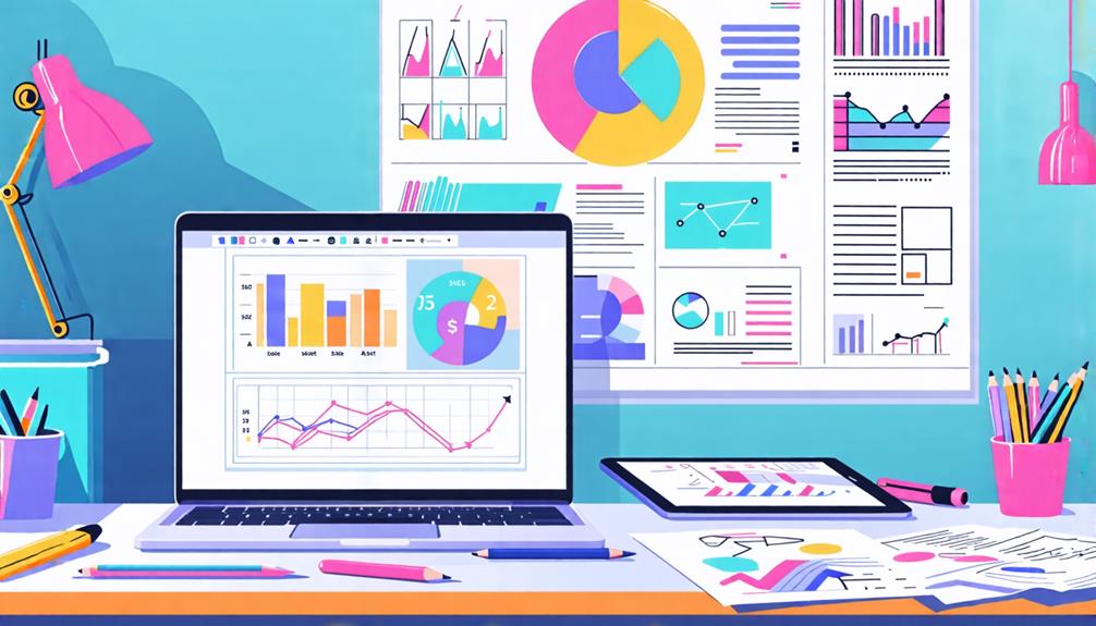
Use Data Visualization Techniques
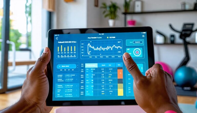
Incorporating data visualization techniques into your side hustle's infographics elevates the presentation of complex information, making it easily digestible and visually engaging for your target audience. This allows your side hustle to effectively communicate its value proposition.
To create effective data visualizations, consider using a range of techniques, including charts, graphs, and maps, to convey key statistics and insights relevant to your side hustle. These visual elements create a clear visual hierarchy, guiding the viewer's eye and drawing attention to the most important information about your side hustle.
Effective data visualization is also crucial for data storytelling in your side hustle, presenting complex data in an easily understandable and interpretable way. By using data visualization techniques, you can create a narrative that is both informative and engaging, drawing the viewer in and encouraging them to explore your side hustle's infographic further.
Conclusion
Effective infographic design for blog posts is akin to crafting a master key that opens audience engagement, fostering a deeper connection with viewers.
By defining target audiences, setting clear goals, and strategically employing visual elements, typography, and color schemes, infographic designs can optimize communication and encourage sharing.
Mobile optimization and data visualization techniques further enhance the design's impact, rendering it a potent tool for achieving desired outcomes and leaving a lasting impression on the audience.

















0
View comments